10 design dos and don'ts for a timeless mid-century modern home
Posted by Sophie Boyce on Updated onIdeas we love and things to avoid
The mid-century modern design style is one of the most recognisable and sought-after to date. Originating in 1945 post-war America, its eclectic mix of old and new makes it accessible for design enthusiasts everywhere. Read our top 10 dos and don’ts to bear in mind when creating a mid-century modern home.
1. Do decide on a colour palette. Burnt orange, deep emerald, a pop of mustard and rich brown shades are usually what come to mind with mid-century interiors, but there are plenty of schemes to explore, and endless ways to use them.
Stick to the reds, blues and yellows inspired by the Bauhaus movement for a bold impactful look, or opt for a more modern twist with a palette of muted neutral shades. Whatever you decide, try to stick to a handful of key colours that you love, and repeat them within your scheme. It’ll make everything feel more grounded and unified amongst your furniture, soft furnishings and artwork.
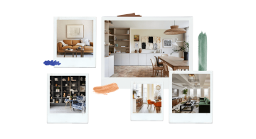
2. Don't do everything on one level. It’s important to vary the height in a mid-century modern space, so if you’re making over a living room, try to juxtapose low coffee tables or sofas with a tall floor lamp or a low-hanging chandelier. This avoids a uniform look that’s more common in traditional and minimalist homes.
Levels don't have to be split just by furniture either - incorporating a fun colour block wall or painted archway can be just as effective.
3. Do mix textures in every room. Unique textiles are a huge part of mid-century modern schemes, from hand woven tapestries and intricate Mexican pottery to Brutalist metal artwork and smooth wooden furniture. It’s important that these elements live harmoniously together, so think about the balance as you walk from room to room.
Layering rugs one on top of another is an easy way to add depth and texture to any space - try placing a large, soft, patterned rug down first as a base, then layerying something textured over the top like sesal. This approach will bring some much-needed warmth to tiled kitchen and bathroom floors.
Pattern and embroidery are commonplace in mid-century homes, but if you prefer a sleeker look, opt for materials like Lucite and plexiglass. Both were hugely popular amongst designers in the 1940s, 50s and 60s, and offer a more minimal aesthetic. Nowadays you’ll most likely find Lucite in the form of coffee tables, side tables and dining chairs, but it’s also made its way into smaller home décor items like candles too.
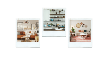
4. Don't overlook the details. While it's easy to get swept away with bigger decisions like which paint to choose or how many art pieces to invest in, with mid-century modern design, the devil is in the detail. Try not to underestimate the impact that subtle changes can have within a home. Instead, balance out your key hero pieces with the perhaps less exciting – but probably more practical – elements to make everything flow together.
With lighting, it can be as simple as adding a couple of wall sconces to complement your feature rattan headboard, or upgrading the dimmer switches to a brushed brass finish throughout the house.
Even simple hardware pieces like the knobs on your kitchen cabinets can instantly make a space look more put-together. For a classic mid-century option, go for something metallic or wooden in material and rounded, rectangular or arched in shape.
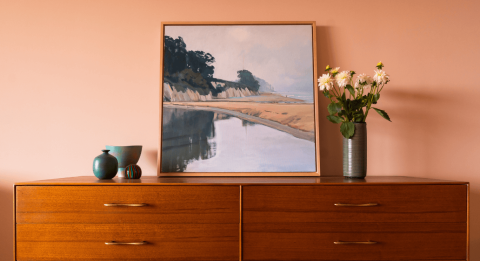
5. Do invest in a statement sideboard. One of the easiest ways to give your home that striking mid-century look is to source an authentic wooden sideboard or credenza. They look great in an entryway beneath an asymmetrical mirror, or in a dining room where you can style them with ikebana vases and a gallery wall of framed artwork.
Sideboards from this era are often finished in dark woods like teak, oak or mahogany. Their impressive size, angled shape and symmetrical design make them the perfect centerpiece if you need to add interest to a blank wall.
6. Don't forget about mirrors. Whether they’re full length, porthole, arched or asymmetric, mirrors are a fool-proof way to inject some mid-century fun into your home. They’re also great for lightening up neglected hallways and smaller bathrooms that don’t have windows.
Our favourites combine an organic pond-like shape with a dark wooden frame, as they’re easily incorporated into most MCM schemes.
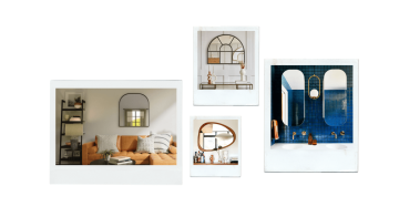
7. Do incorporate unique spaces like a reading nook or a bar, especially if you’re renovating. Larger scale, longer term projects are the perfect opportunity to indulge in novel features and really make a space your own.
Mid-century modern design is about curating and collecting over time, so making a feature out of your bookshelf and displaying your favourite reads is an easy way to pay homage, while adding a little luxury to everyday life.
Invest in a womb chair to curl up in for a true mid-century finish – this iconic piece of furniture was pioneered in 1948 by mid-century designer Eero Saarinen, who was tasked to create “a chair that was like a basket full of pillows” – promising style and comfort in one.
8. Don't over-accessorize. It can be tempting to run wild with the eclectic nature of this design style, but avoid the clutter where you can. The great thing about sideboards, bedside tables and media consoles from this era is that they’re practical and great for storage, often with drawers and shelves built in.
Choose your favourite plants and homeware pieces to display in areas like open kitchen shelving, then tuck the rest away. For a bohemian touch, baskets are a must. Playing around with a couple of different sizes can look particularly beautiful in bathrooms or guest bedrooms for storing away linen and towels.
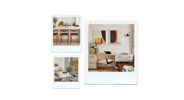
9. Do add legs to your existing furniture if you’re not looking to buy new. Hairpin-legged furniture is a classic silhouette within this design style and can be easily achieved by upcycling items you already own.
Why not craft a bespoke desk for your home office by attaching four black legs to a wooden countertop, or revamp a coffee table by raising it up and creating some all new storage space for baskets and boxes underneath.
10. Don't compromise what you love just because it doesn’t tick all of the stereotypical mid-century modern boxes. Embrace the eclectic – and sometimes chaotic – nature of the beast and try not to pigeonhole yourself or your home into one specific style.
Homes are personal, and chances are you’ll take inspiration from a plethora of eras, locations and artists before putting a label on the style you love.
Mid-century modern meets Cornwall
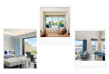
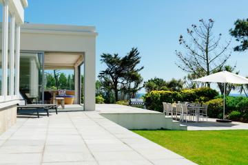
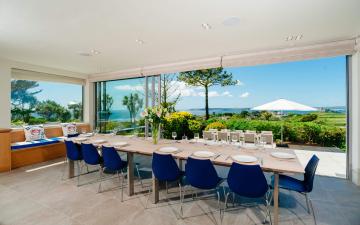
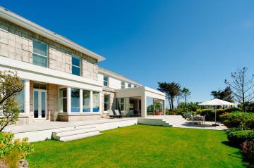
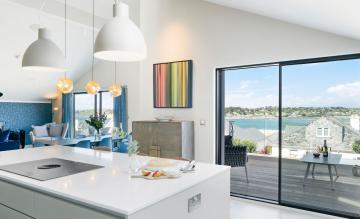
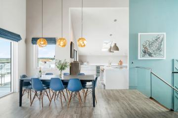
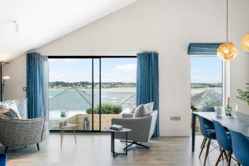
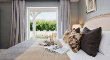
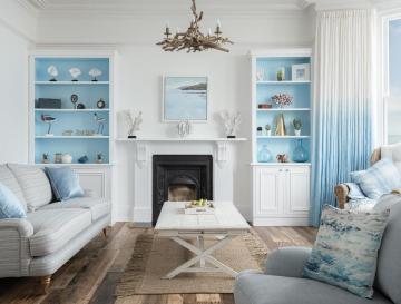
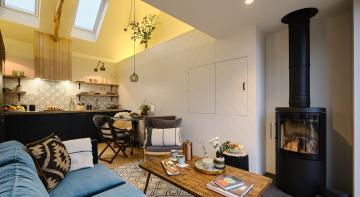
Pictured above are Ednovean House in Perranuthnoe and Kilden Mor in Padstow. Using deep rich woods, statement wallpaper and interesting textures throughout, these homes make the perfect Cornish hideaway to soak up some mid-century modern inspiration.
Image credits: The two property photos above are our own. The remaining inspiration images are from Pinterest and Unsplash
Posted by Sophie Boyce
When she's not out for a roast by the coast, Sophie loves exploring with her husband and their golden retriever pup, Obi. She writes about all things Cornwall and is a strong believer that there’s no such thing as too many house plants.


